Brand Identity & Visual System
Soulsy Wellness
Role: Brand Strategy, Visual Identity Design
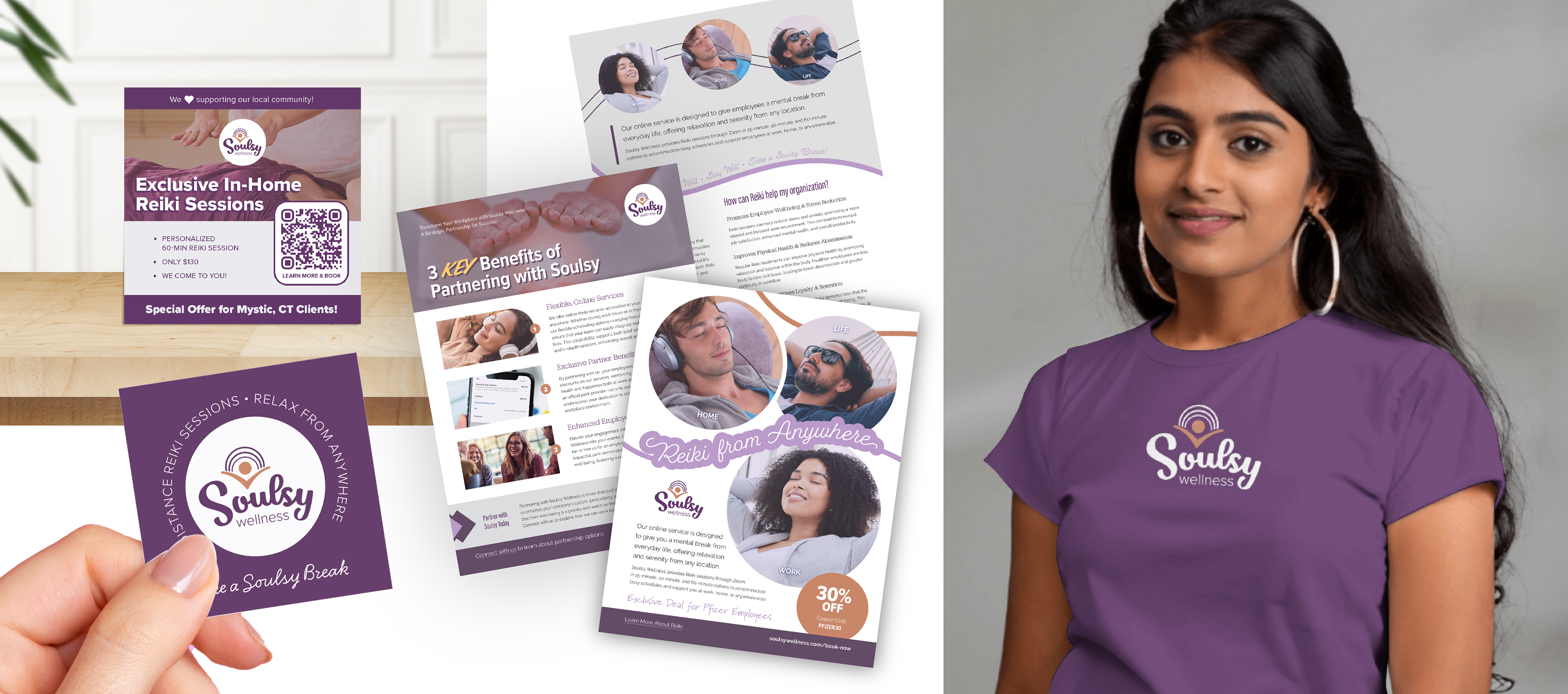
Deliverables: Logo system, color palette, visual system, digital + print applications
Tools: Illustrator, Photoshop, Squarespace
Deliverables: Logo system, color palette, visual system, digital + print applications
Tools: Illustrator, Photoshop, Squarespace
Overview
Soulsy Wellness is a Reiki and nervous-system regulation practice designed to support grounded presence, emotional steadiness, and embodied safety in an increasingly overstimulated world.
The brand required a visual identity that conveyed trust, calm, and credibility without leaning into common wellness tropes or an overly decorative aesthetic. The goal was to create a system that felt emotionally resonant yet professionally grounded, capable of scaling across digital and print touch points while maintaining long-term integrity.

Challenge
– Communicate calm and trust without appearing generic or trend-driven
– Support ease and clarity rather than sensory overload
– Design a system, not a single visual expression
– Balance emotional resonance with professional credibility
– Support ease and clarity rather than sensory overload
– Design a system, not a single visual expression
– Balance emotional resonance with professional credibility
Strategy: Designing for Presence
Rather than focusing on surface aesthetics, the strategy centered on how the brand should feel when someone interacts with it.
The guiding principle was presence—creating visual space that keeps the work central without distraction. Every design decision was evaluated through the lens of clarity, confidence, and continuity.
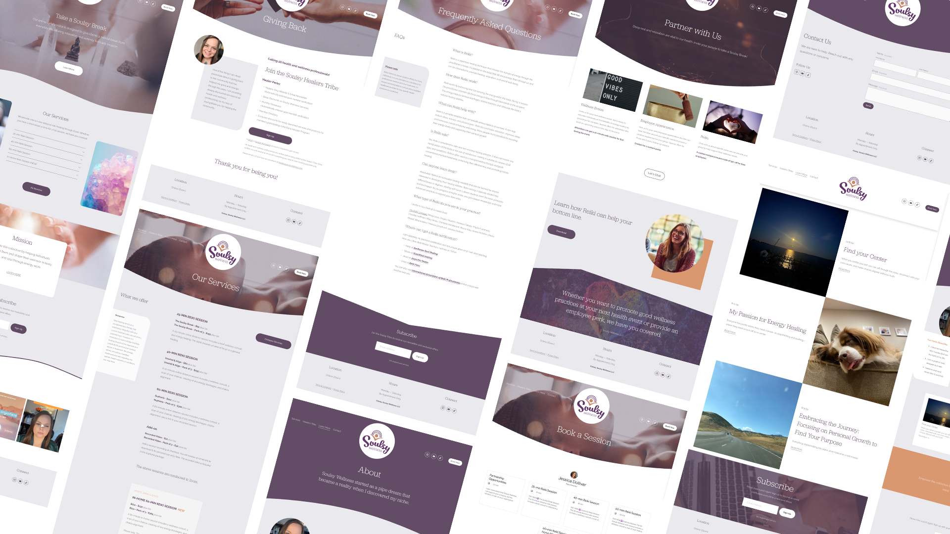
The identity was intentionally designed as a long-term system, built to remain consistent across platforms while offering sufficient flexibility to evolve with the practice.
Design Choices
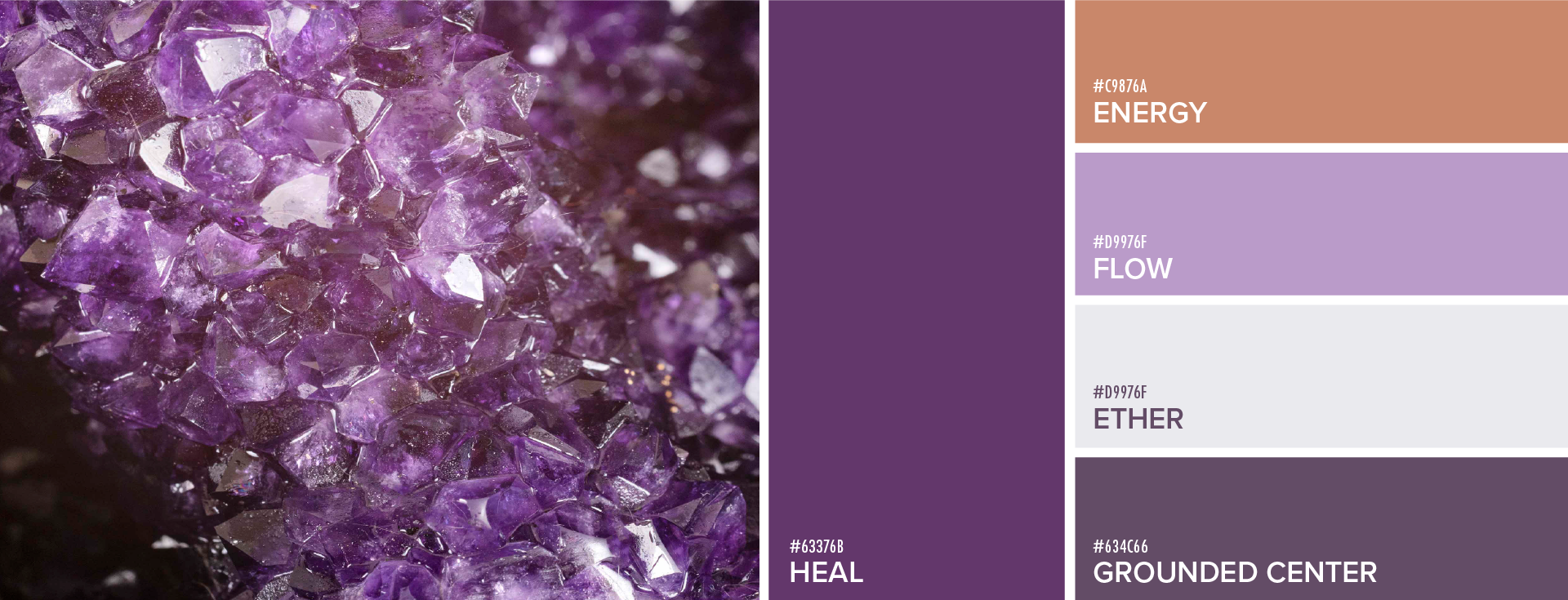
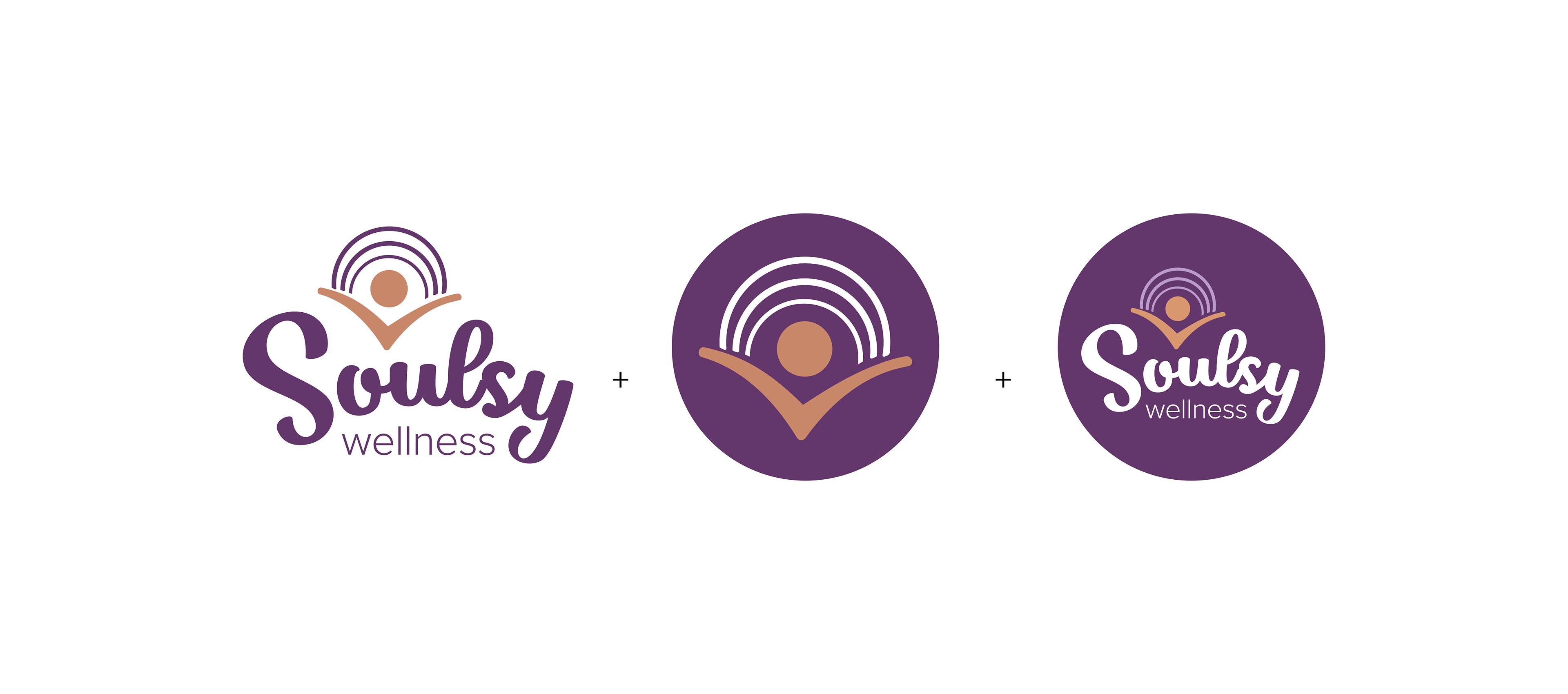
The core palette of purple and white was selected to establish Soulsy Wellness as a composed, credible presence within the wellness market. These tones signal discernment, clarity, and intention, supporting a brand position that feels purposeful rather than trend-driven.
Orange accents were introduced as a strategic counterbalance to add warmth and forward momentum at key interaction points. Used selectively, the accent color supports visual hierarchy and attention flow while preserving the brand’s overall sense of stability.
Together, the palette functions as a cohesive system that balances calm authority with measured energy, enabling the brand to consistently communicate trust, focus, and confidence across platforms.
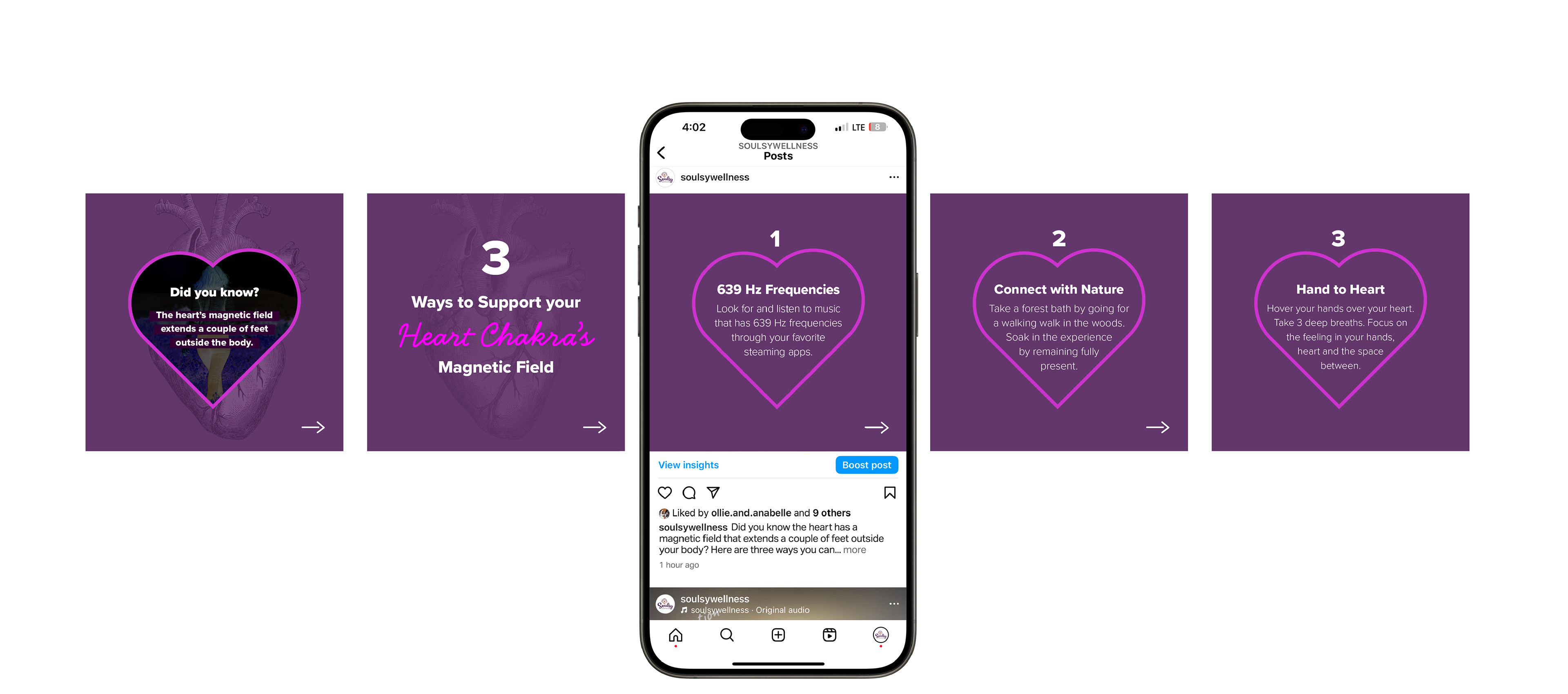
Visual System Approach: Presence & Flow
The visual system was crafted around the principles of presence and flow, shaping how the brand is experienced rather than simply how it appears.
Presence informed decisions around spacing, clarity, and focus, ensuring the brand communicates steadiness, intention, and confidence at every point of interaction.
Flow guided the relationship between elements, influencing rhythm, alignment, and transitions throughout the system. These principles support a brand experience that feels cohesive, intuitive, and supportive, while remaining flexible and scalable as the business grows.
Outcome
The final identity provides Soulsy Wellness with a clear, reliable visual foundation that supports consistency, trust, and long-term growth.
The system allows the brand to appear confident and grounded across platforms while remaining aligned with its core values and adaptable to future offerings. The result is a brand presence that feels calm, intentional, and deeply supportive without sacrificing professionalism or clarity.