Global Studies Brand Transformation
Teachers' Memorial Global Studies Magnet Middle School
Role: Brand Strategy, Art Direction, Copywriting, Project Management
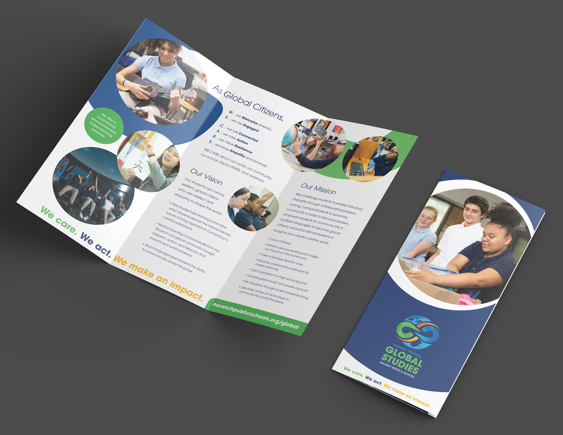
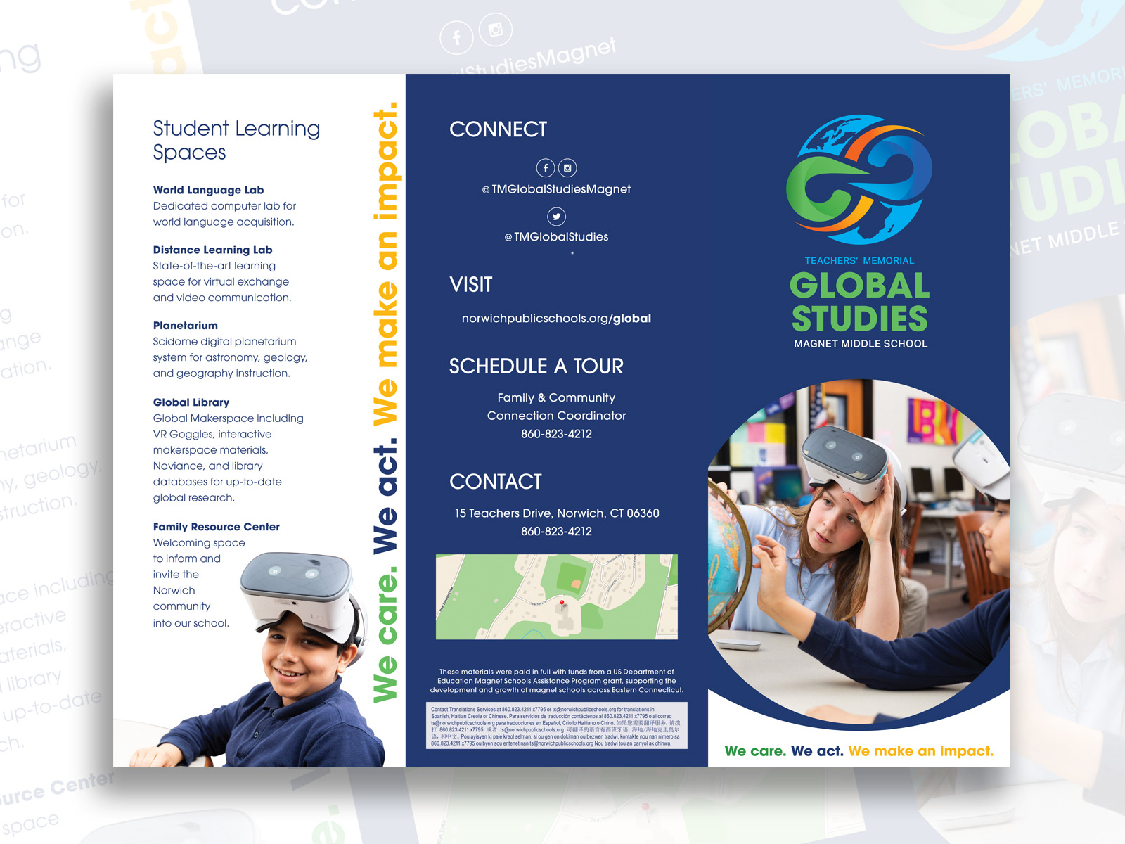
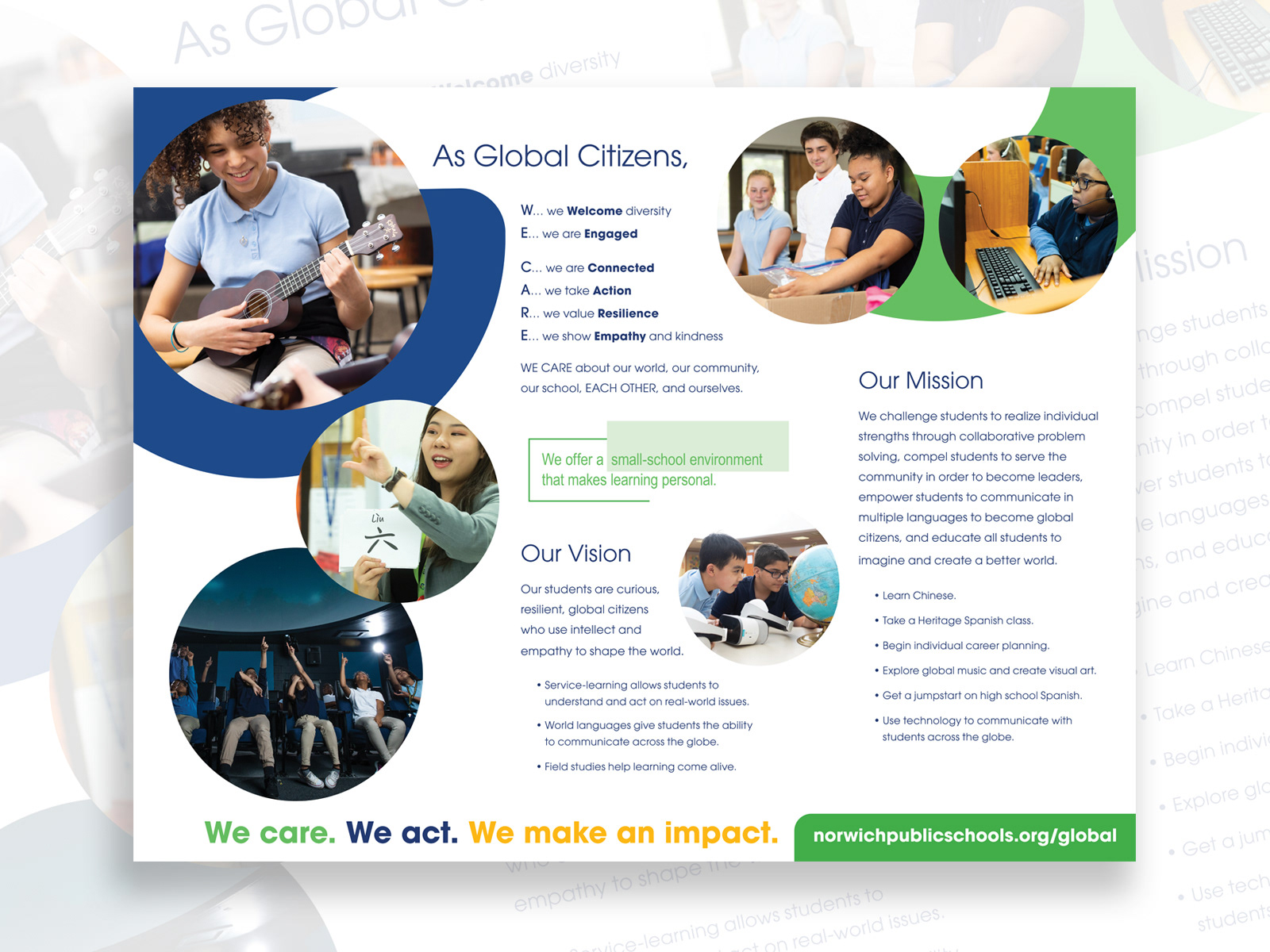
Deliverables: Brand identity system, Logo development (external designer collaboration + internal alignment), Exterior environmental graphics and signage, Interior environmental branding, Wayfinding system, Marketing and recruitment messaging, Multimedia assets supporting outreach and recruitment
Tools: Illustrator, InDesign, Photoshop
Overview
This project involved a full rebrand, transitioning a traditional public middle school into a Global Studies magnet institution.
The work required reshaping both perception and physical experience, ensuring the new identity felt credible, aspirational, and visibly distinct, even as the magnet theme and mission were still being defined.
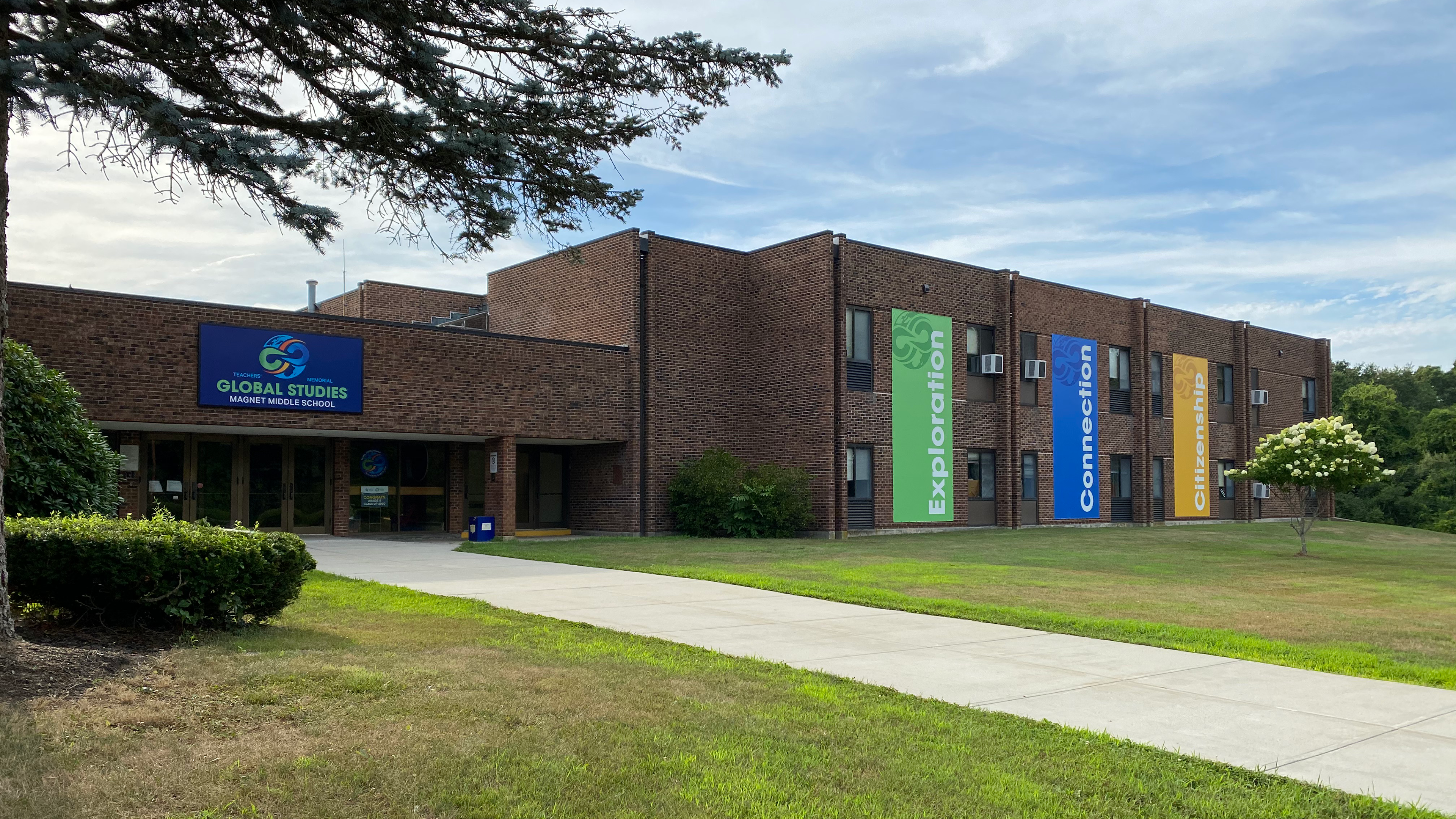
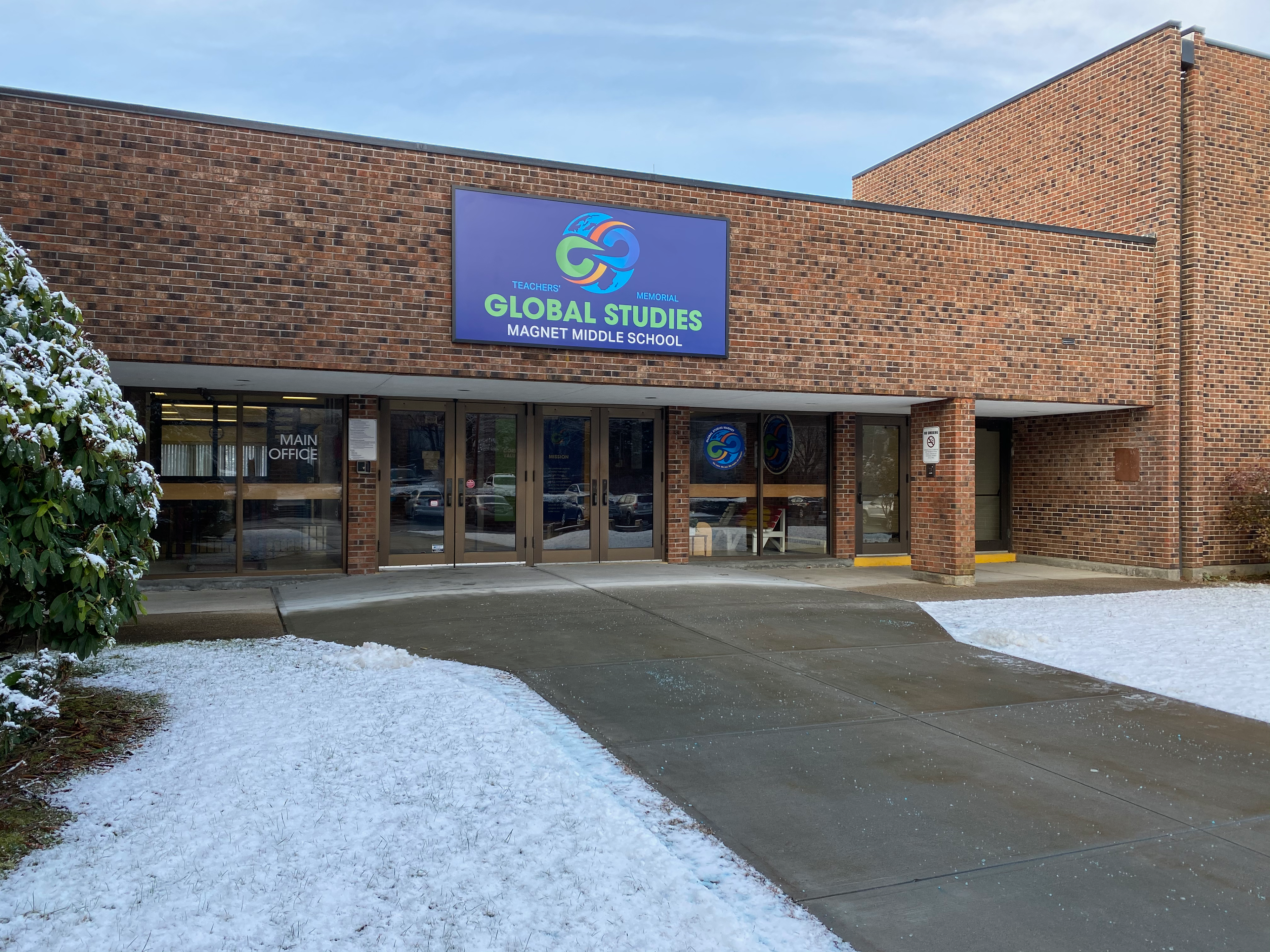
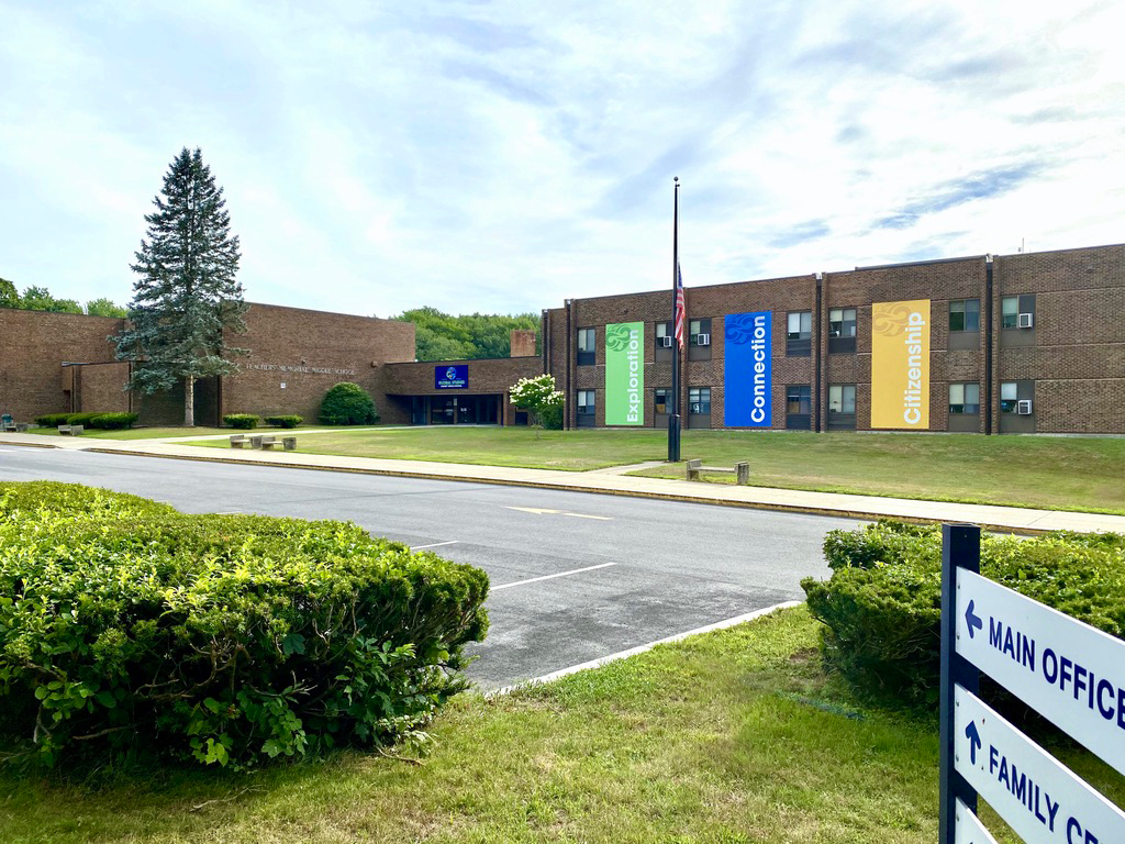
PHASE 1 - Exterior Branding and Wayfinding

Challenge
– Poor public perception and declining enrollment interest
– An aging facility with inconsistent and outdated signage
– A compressed timeline alongside an evolving mission and vision
– The brand needed to communicate transformation quickly and convincingly.
– An aging facility with inconsistent and outdated signage
– A compressed timeline alongside an evolving mission and vision
– The brand needed to communicate transformation quickly and convincingly.
Strategy
The strategy focused on building the brand simultaneously across identity, messaging, and environment.
By aligning visual systems, language, and physical space in parallel, the school’s transformation became visible and believable as the magnet program took shape.
PHASE 2 - Interior Environmental Branding
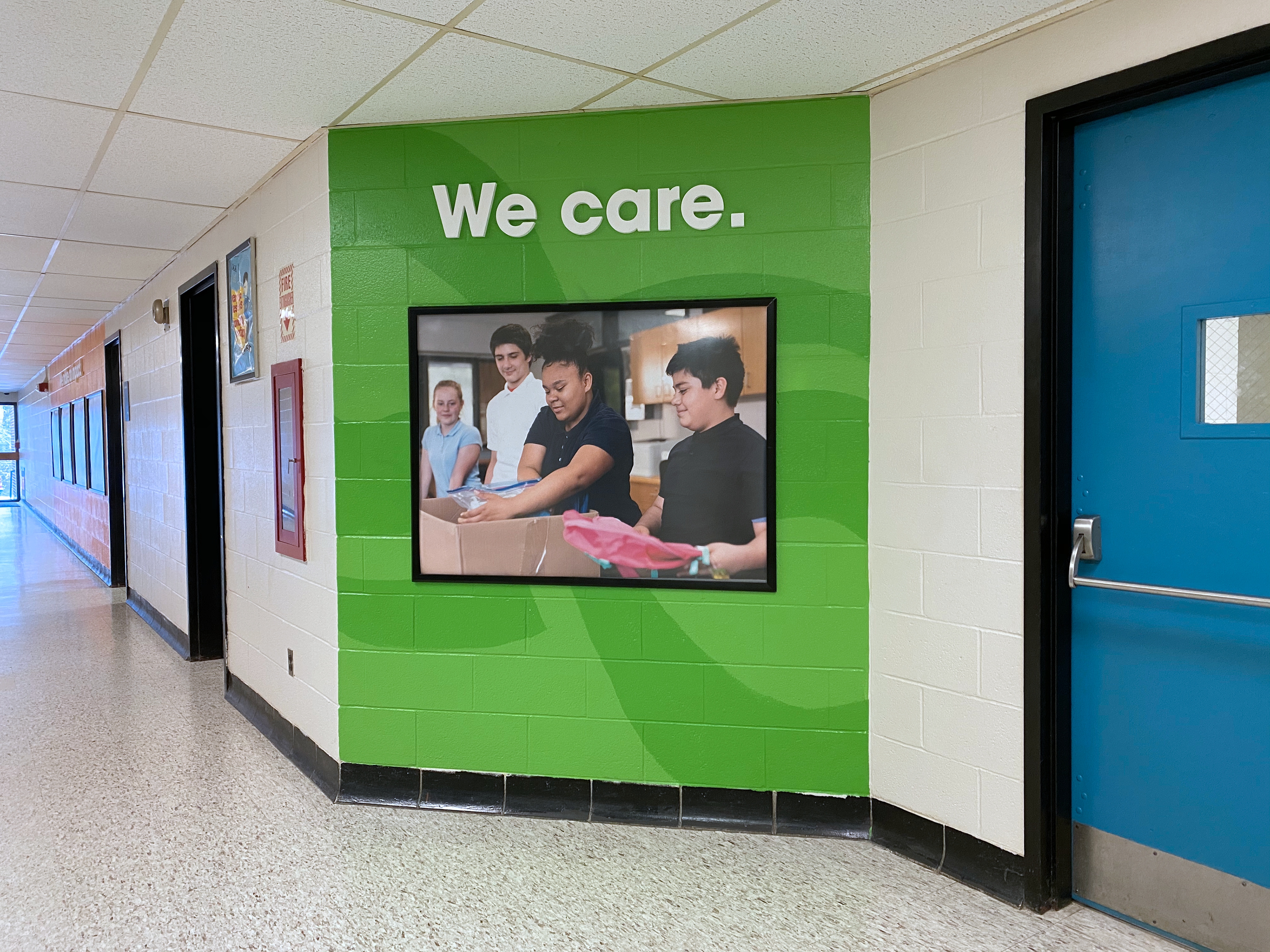
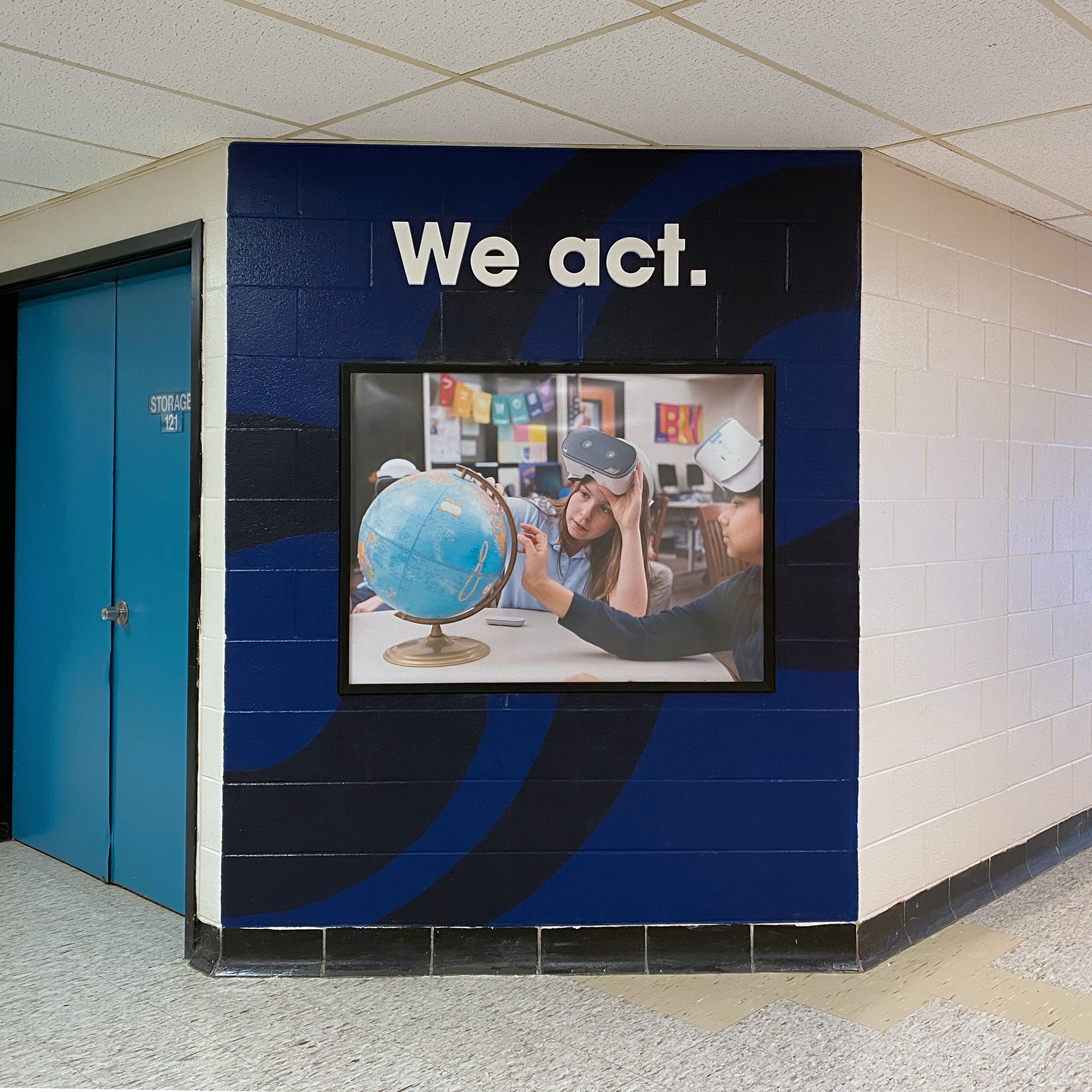
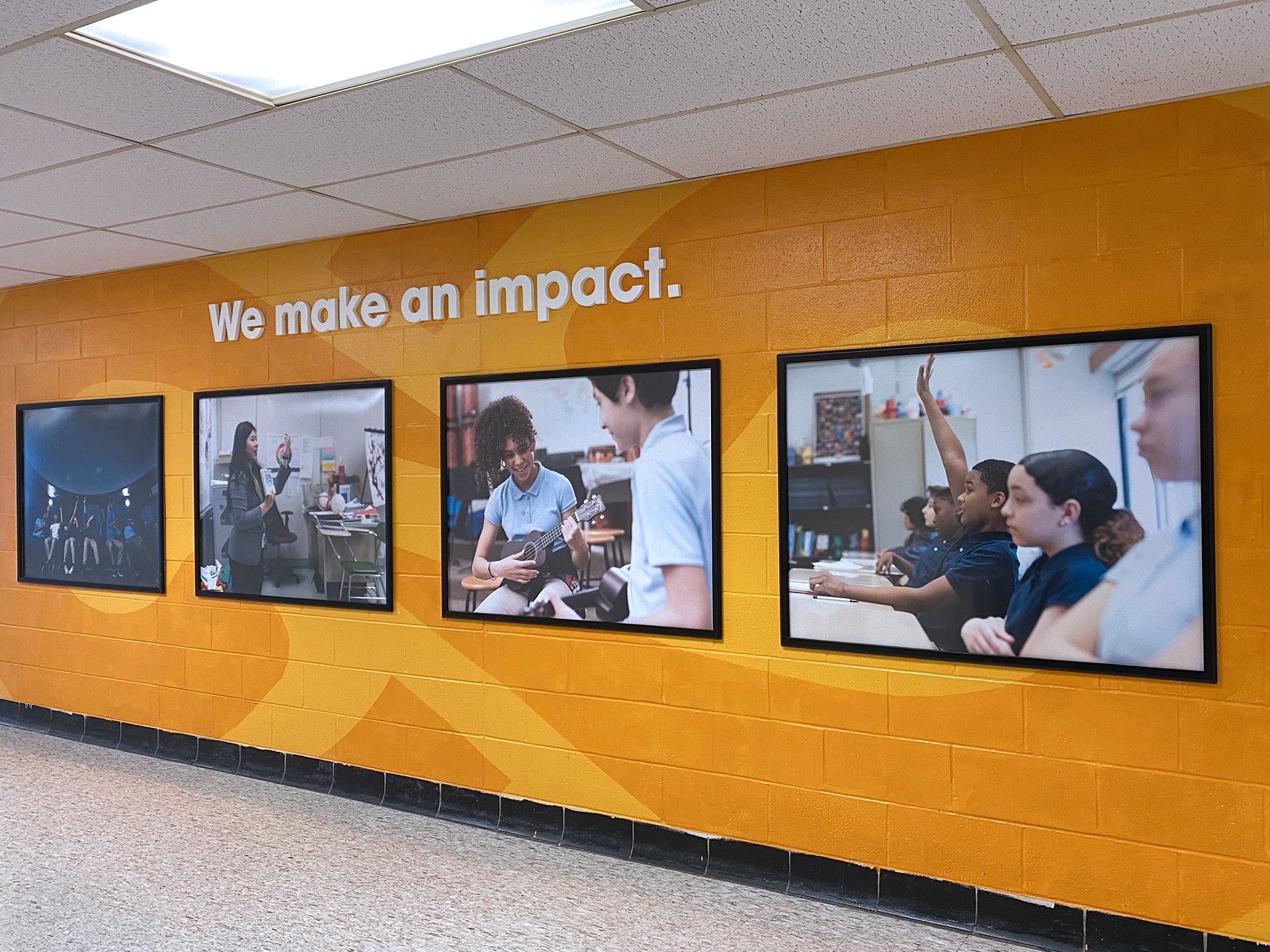
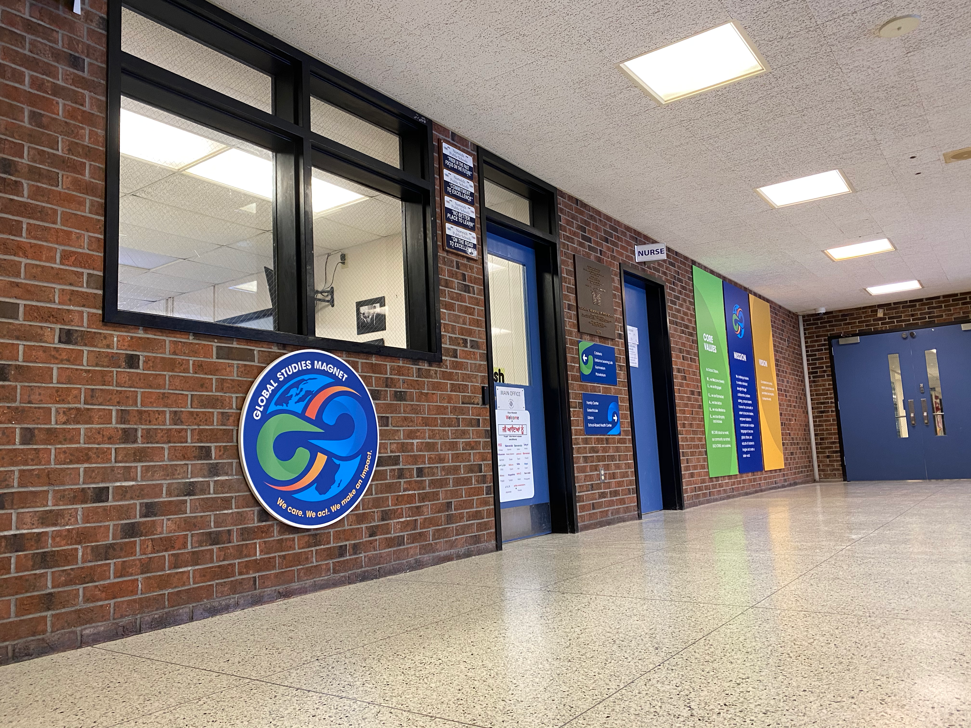
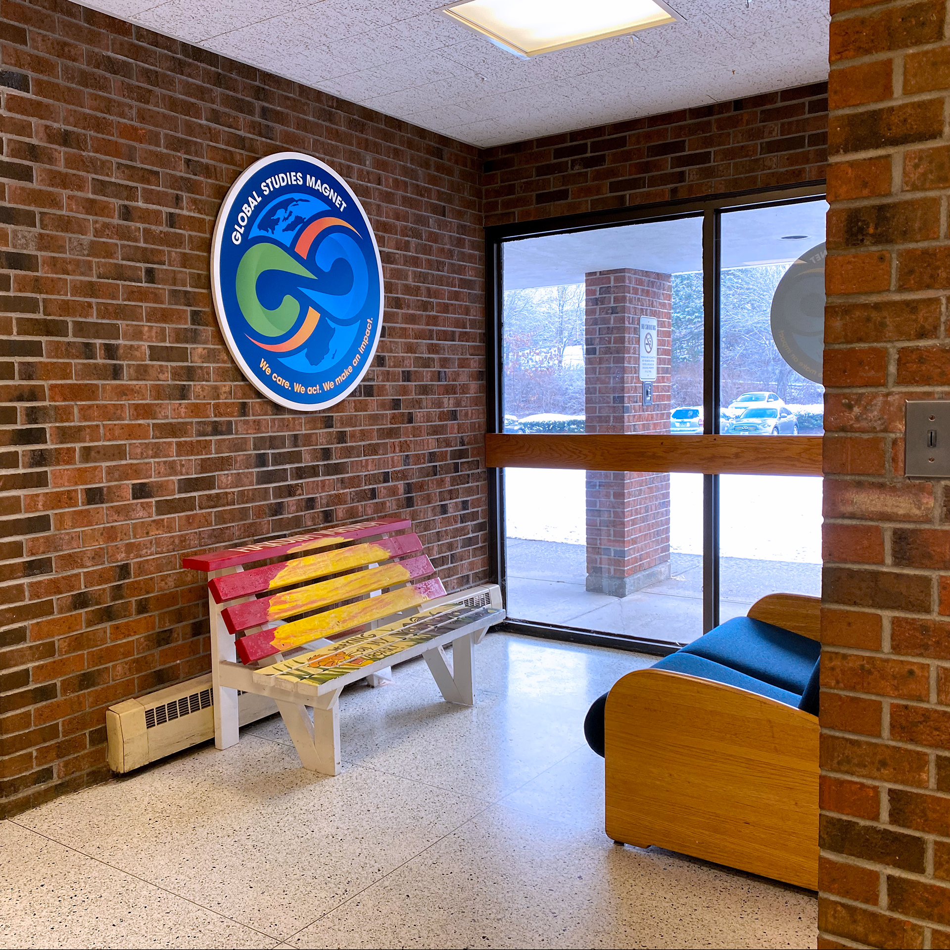
Before & After Views and Additional Signage
Process
Discovery and Foundation
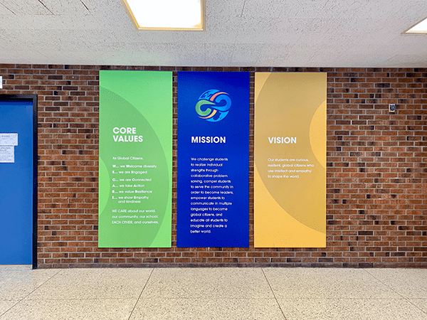
I guided staff in developing the magnet school’s mission, vision, and core values, coordinating with an external magnet-school consultant and district leadership.
Research and groundwork included magnet school analysis, competitive and SWOT research, brand and environmental audits, campus documentation, and vendor sourcing.
Messaging and Positioning
Working directly with staff, I clarified the school's identity, its desired perception, and what made the magnet program distinct. These insights shaped core brand messaging, recruitment copy, and consistent talking points for outreach.
Identity Development
To ensure objectivity, I partnered with an external designer for logo development while providing strategic direction, facilitating feedback, and ensuring alignment with the broader brand system. I then led execution across all applications.
PHASE 3 - Multimedia Assets


Execution
Phase 1: Exterior Branding and Wayfinding
Exterior graphics and signage were redesigned to signal a change immediately. A clear wayfinding system and primary monument signage replaced inconsistent legacy elements, creating a strong arrival experience and instant perception shift.
Phase 2: Interior Environmental Branding
High-traffic spaces, including the lobby, the walls adjacent to the cafetorium, and key hallways, were updated to reinforce the magnet identity without requiring a full renovation.
Phase 3: Multimedia Assets
Supporting materials extended the brand across marketing and recruitment channels, maintaining consistency beyond the physical campus.
Outcome
The rebrand delivered a clear and visible transformation of the school’s identity.
Families and prospective students experienced a stronger, more cohesive first impression, while staff gained a brand system they could confidently represent. The environmental branding made the magnet mission tangible, reinforcing belief in the school’s new direction.