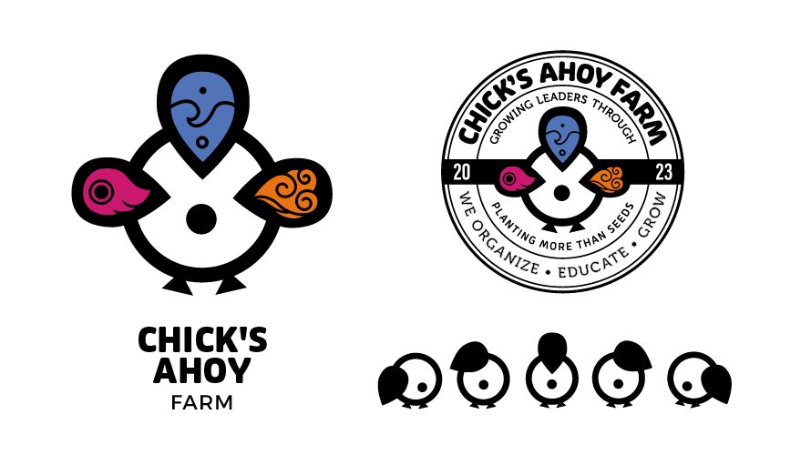
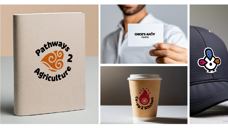
Brand Identity & Visual System
Chick's Ahoy Farm
Role: Brand Strategy, Visual Identity Design
Deliverables: Logo system, color palette, visual system
Tools: Illustrator, Photoshop
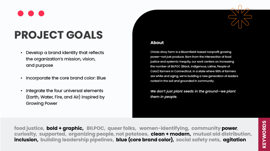
Overview
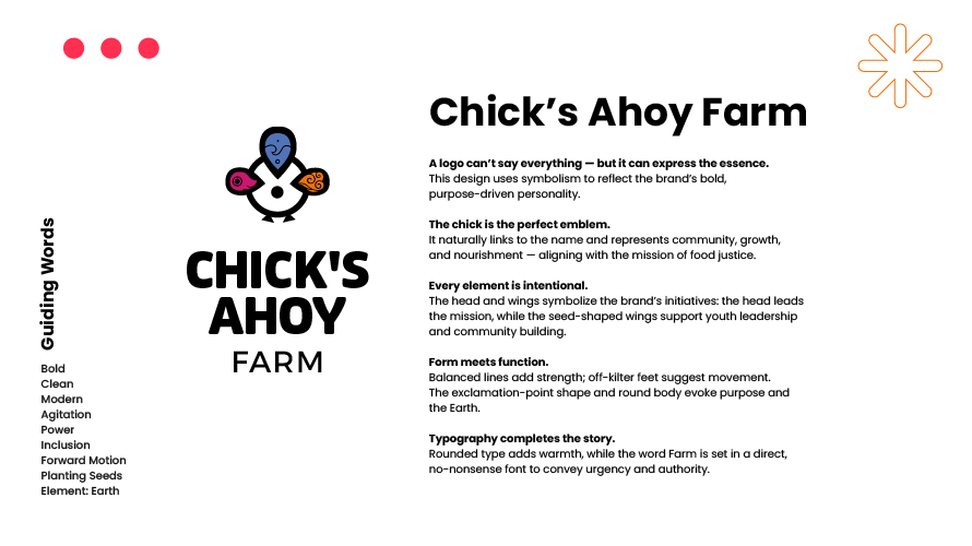
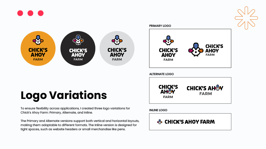
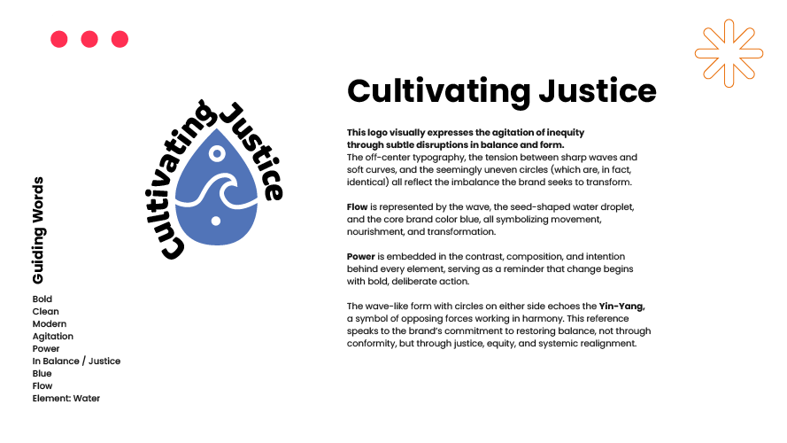
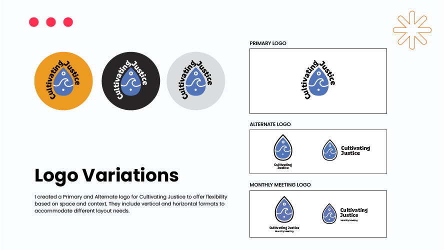
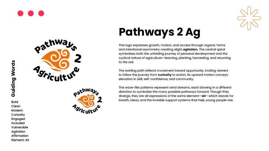
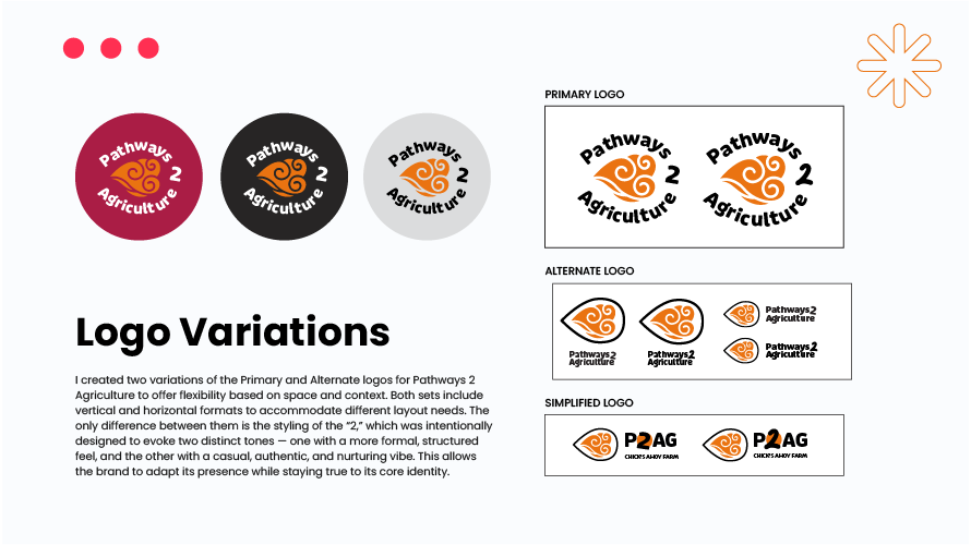
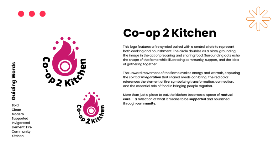
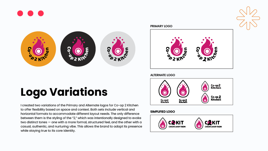
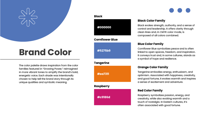
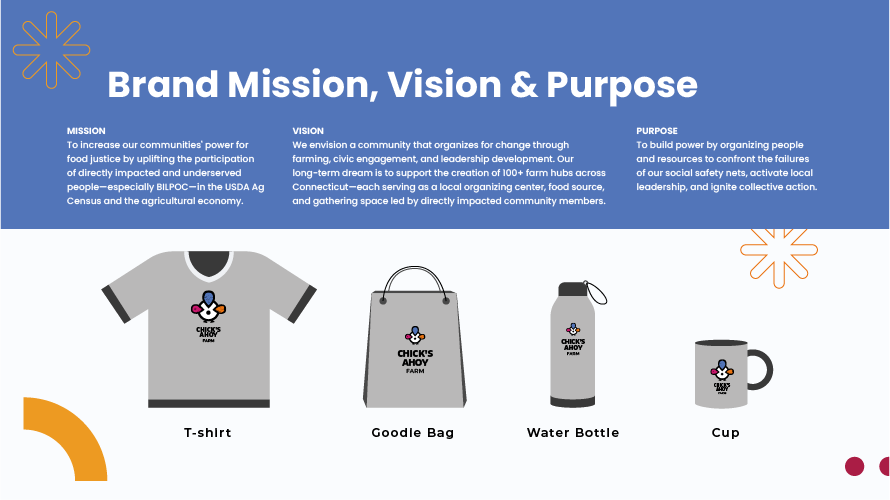
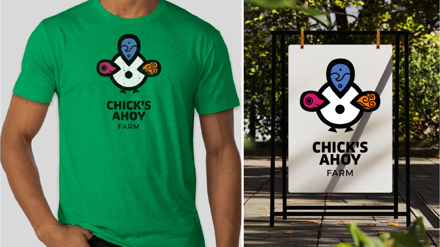
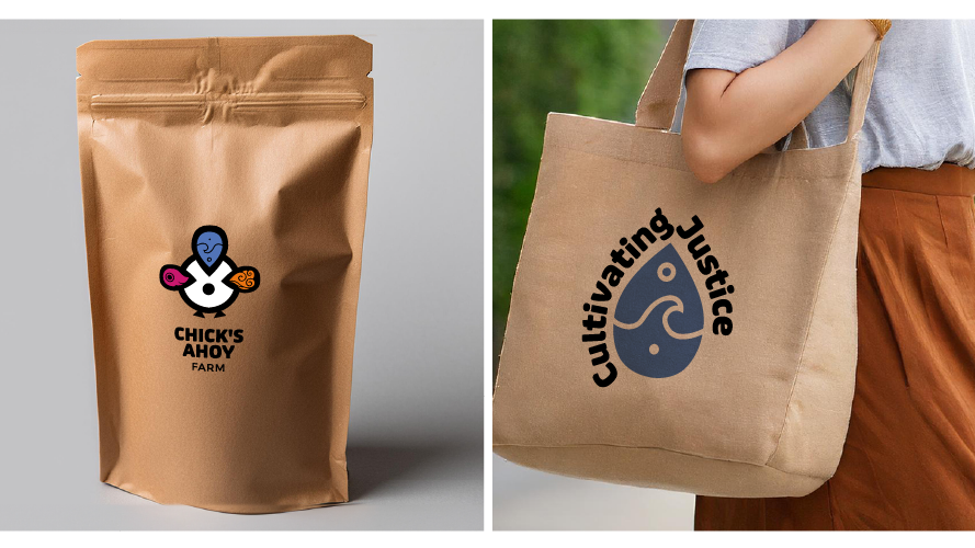
A cohesive brand identity system for Chick’s Ahoy Farm, a Connecticut-based nonprofit advancing food justice and community power. The work includes a core brand mark and flexible sub-brand identities—Pathways 2 Agriculture, Co-op 2 Kitchen, and Cultivating Justice—designed to scale across programs, merchandise, and public-facing materials. The system integrates bold typography, symbolic illustration, and a purposeful color palette rooted in growth, equity, and collective action.
Chick’s Ahoy Farm brand presentation cover with abstract seed icon on blue background.
Project goals and mission statement for Chick’s Ahoy Farm nonprofit.
Chick’s Ahoy Farm logo with elemental chick illustration and brand explanation.
Chick’s Ahoy Farm primary, alternate, and inline logo formats.
Abstract chick symbol with four elemental icons and circular seal variation.
Cultivating Justice logo featuring water droplet symbol and justice-themed typography.
Cultivating Justice logo shown in multiple colorways and layout formats.
Pathways 2 Agriculture logo with spiral seed symbol representing growth and movement.
Pathways 2 Agriculture primary, alternate, and simplified logo layouts.
Co-op 2 Kitchen logo variations with fire-inspired icon and brand description.
Co-op 2 Kitchen primary, alternate, and simplified logo variations.
Chick’s Ahoy Farm coffee-style packaging and Cultivating Justice tote bag mockup.
Brand color palette featuring black, cornflower blue, tangerine, and raspberry.
Brand mission, vision, and purpose with Chick’s Ahoy Farm merchandise examples.
Chick’s Ahoy Farm logo applied to t-shirt and outdoor sign.
Chick’s Ahoy Farm coffee-style packaging and Cultivating Justice tote bag mockup.
Co-op 2 Kitchen primary, alternate, and simplified logo variations.

YOU MAY ALSO LIKE:

Back to Top